This tutorial will you to send Email via SMTP using PHP coding. First we have to declare and assign the value for variables like First Name, Last Name, Email id to whom we need to send the email
Image Cropping using JQuery & PHP Coding
Today we are going to see how to crop the Image as we need using JQuery in PHP and we are going to store that cropped image in MySql database.
Here is the sample Screen Shot
Create the MySql database with needed information like user id, username, password, email, profile image, profile image small for cropped image.
Posted by VK 0 comments
Labels: AJAX, CSS, HTML Coding, JQuery Coding
Generate text file using Java Script Coding
In this tutorial we are going to see how to create file in web using Java Script. User have to enter the text in text and when they click the submit or download button, then the user can download that typed text in a text document.
First we will design the web page by using HTML, We need one Textbox and command button to download the text in textbox.
Sample Screenshots
Posted by VK 0 comments
Labels: CSS, HTML Coding, Java Script Coding
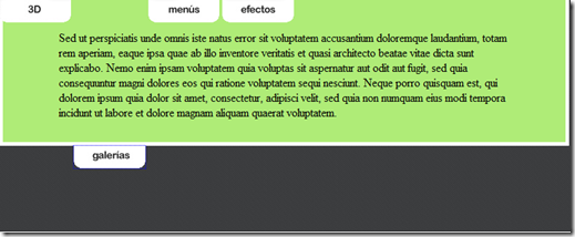
Attractive Menu using CSS3
In this Tutorial we are going to see attractive menu using CSS3.
First design the menu using HTML tags,
Posted by VK 0 comments
Labels: AJAX, CSS, HTML Coding
Ajax Coding: Top Drop Down Menu
In this Ajax Coding we are going to design a menu which can slide downwards and we can put some content in that dropdown area.

Posted by VK 0 comments
Labels: AJAX, CSS, HTML Coding, Java Script Coding
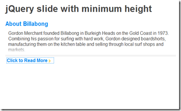
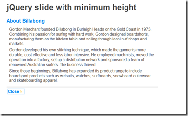
Sliding Read More in JQuery
In this tutorial we are going to see how read more option can be effectively and attractively used using JQuery.
XHTML Coding
Here we are creating the layout of the page using <div> tag, then using that <div> tag we are going to apply the JQuery.
<div id="container">
<h1>jQuery slide with minimum height
<h2>About Billabong</h2>
<div id="wrap">
<div>
<p>Gordon Merchant founded Billabong in Burleigh Heads on the Gold Coast in 1973. Combining his passion for surfing with hard work, Gordon designed boardshorts, manufacturing them on the kitchen table and selling through local surf shops and markets.</p>
<p>Gordon developed his own stitching technique, which made the garments more durable, cost effective and less labor intensive. He employed machinists, moved the operation into a factory, set up a distribution network and sponsored a team of renowned Australian surfers. The business thrived.</p>
<p>Since those beginnings, Billabong has expanded its product range to include boardsport products such as wetsuits, watches, surfboards, snowboard outerwear and skateboarding apparel.</p>
<p>Information courtesy of <a title="Billabong" href="http://www.billabong.com/us/">Billabong</a>.</p>
</div>
<div id="gradient"></div>
</div>
<div id="read-more"></div>
</div>
JQuery Coding
Using JQuery Coding we are going to apply the sliding animation.
$(function(){
var slideHeight = 75; // px
var defHeight = $('#wrap').height();
if(defHeight >= slideHeight){
$('#wrap').css('height' , slideHeight + 'px');
$('#read-more').append('<a href="#">Click to Read More</a>');
$('#read-more a').click(function(){
var curHeight = $('#wrap').height();
if(curHeight == slideHeight){
$('#wrap').animate({
height: defHeight
}, "normal");
$('#read-more a').html('Close');
$('#gradient').fadeOut();
}else{
$('#wrap').animate({
height: slideHeight
}, "normal");
$('#read-more a').html('Click to Read More');
$('#gradient').fadeIn();
}
return false;
});
}
});
CSS Coding
/* simple reset */
html,body,div,h2,p {margin:0;padding:0;}html {
font:1em Arial, Helvetica, sans-serif;
color:#444;
}
a {color:#0087f1;}
p {margin-bottom:5px;}
#container {
margin:0 auto;
width:600px;
}
#container h2 {
font-size:20px;
color:#0087f1;
}
#wrap {
position: relative;
padding: 10px;
overflow: hidden;
}
#gradient {
width:100%;
height:35px;
background:url(images/bg-gradient.png) repeat-x;
position:absolute;
bottom:0;
left:0;
}
#read-more {
padding:5px;
border-top:4px double #ddd;
background:#fff;
color:#333;
}
#read-more a {
padding-right:22px;
background:url(images/icon-arrow.gif) no-repeat 100% 50%;
font-weight:bold;
text-decoration:none;
}
#read-more a:hover {color:#000;}
Posted by VK 0 comments
Labels: CSS, HTML Coding, Java Script Coding
Multi-color for Tool Tips–”CSS3”
In this tutorial we are going learn how to make multi color tool tips for the text.
Download the Multi Color for Tool Tips Source Code
HTML
<a href="#" class="tooltip">
  your text
  <span>Your tooltip description</span>
</a>
Java Script
<script type="text/javascript" src="http://code.jquery.com/jquery-latest.min.js"></script>
<script type="text/javascript">
  $(function() {
    if ($.browser.msie && $.browser.version.substr(0,1)<7)
    {
      $('.tooltip').mouseover(function(){
            $(this).children('span').show();
          }).mouseout(function(){
            $(this).children('span').hide();
          })
    }
  });
</script>
CSS
.tooltip
{
  position: relative;
  background: #eaeaea;
  cursor: help;
  display: inline-block;
  text-decoration: none;
  color: #222;
  outline: none;
}

.tooltip span
{
  visibility: hidden;
  position: absolute;
  bottom: 30px;
  left: 50%;
  z-index: 999;
  width: 230px;
  margin-left: -127px;
  padding: 10px;
  border: 2px solid #ccc;
  opacity: .9;
  background-color: #ddd;
  background-image: -webkit-linear-gradient(rgba(255,255,255,.5), rgba(255,255,255,0));
  background-image: -moz-linear-gradient(rgba(255,255,255,.5), rgba(255,255,255,0));
  background-image: -ms-linear-gradient(rgba(255,255,255,.5), rgba(255,255,255,0));
  background-image: -o-linear-gradient(rgba(255,255,255,.5), rgba(255,255,255,0));
  background-image: linear-gradient(rgba(255,255,255,.5), rgba(255,255,255,0));
  -moz-border-radius: 4px;
  border-radius: 4px;
  -moz-box-shadow: 0 1px 2px rgba(0,0,0,.4), 0 1px 0 rgba(255,255,255,.5) inset;
  -webkit-box-shadow: 0 1px 2px rgba(0,0,0,.4), 0 1px 0 rgba(255,255,255,.5) inset;
  box-shadow: 0 1px 2px rgba(0,0,0,.4), 0 1px 0 rgba(255,255,255,.5) inset;
  text-shadow: 0 1px 0 rgba(255,255,255,.4);
}

.tooltip:hover
{
  border: 0; /* IE6 fix */
}

.tooltip:hover span
{
  visibility: visible;
}

.tooltip span:before,
.tooltip span:after
{
  content: "";
  position: absolute;
  z-index: 1000;
  bottom: -7px;
  left: 50%;
  margin-left: -8px;
  border-top: 8px solid #ddd;
  border-left: 8px solid transparent;
  border-right: 8px solid transparent;
  border-bottom: 0;
}

.tooltip span:before
{
  border-top-color: #ccc;
  bottom: -8px;
}
Download the Multi Color for Tool Tips Source Code
Posted by VK 0 comments
Labels: CSS, HTML Coding, Java Script Coding


